I’ve designed a few customer journey maps as part of the deliverables to a large innovation project. This work is part of a consortium formed by two academic institutions and four industry partners named CLoSeR. The collaborative nature of this research requires synergy between academia and external organisations, combining research methods to better inform the production of innovation that could improve user experiences.
One common way to understand and visualise UX is through the design of Customer Journey Maps, which are graphical representations of one’s encounters with the products, services or systems. These diagrams usually contain different stages of the journey, user actions and emotions. The map displays the ‘touchpoints’ for each main point of contact between the user and the system, where some sort of interaction took place.
The process for designing customer journey maps involves collecting
qualitative data, usually through interviews, where participants report the significant occurrences and issues during the interaction with the product, service or system. Interview transcripts are then subject to a thematic analysis, and these themes inform the elements that define the touchpoints in question. It is also possible to obtain opinions from participants using questionnaires handed to the target population.
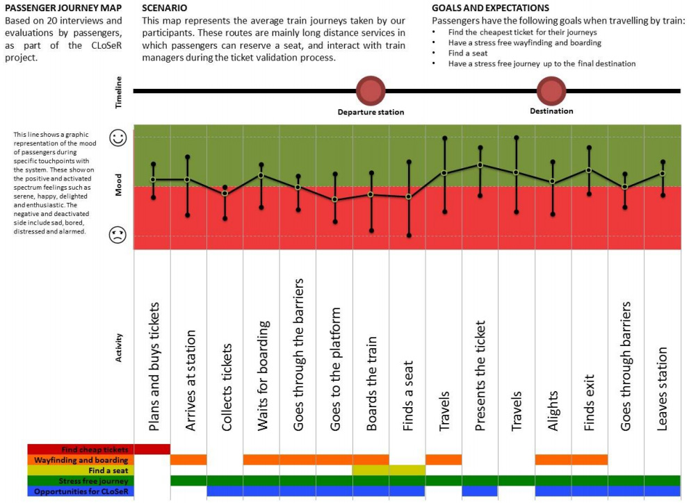
Passenger customer journey map
The map below shows the experience of train passengers from the moment they start planning and purchasing tickets until when they alight at the destination station.
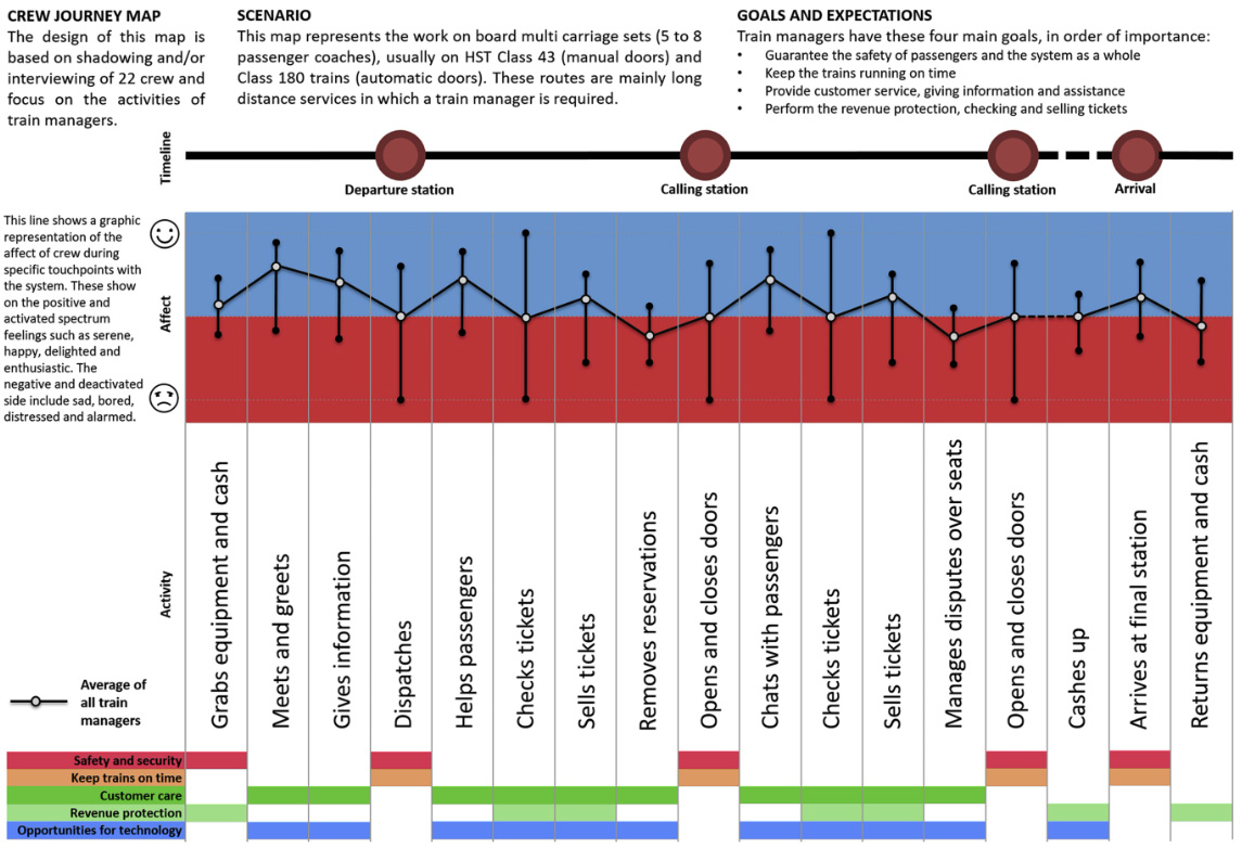
Crew journey map
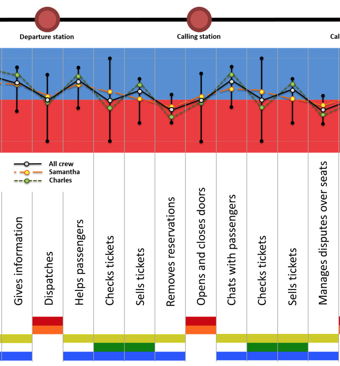
Another example present a similar touchpoint to represent the experiences of crew members. It’s important to note that crew will have different touchpoints to passengers, and different mood and affect at each of them.
Customer journey map and persona integration
In the example below we also aggregated information about two personas, which were created in parallel. This way, we had the chance to indicate where their experiences differ, and it suggested how the system should be designed to cater for both types of crew.