When I bought Think Like a UX Researcher, the related book suggestions at the bottom of the page included Just Enough Research, by Erika Hall. So I bought it and read it from time to time.
As the title suggests, it starts from the question we sometimes ask ourselves, “how much research is enough“? There’s always the feeling that we could’ve researched a bit more, talked to more people, analysed the data a bit more deeply. But … Read more →
I was given a copy of Outcomes Over Outputs by Joshua Seiden. It’s a very short book with a super clear message: we need to focus on outcomes rather than just designing and delivering outputs like features, code, or other deliverables.
Seiden defines an outcome as “a change in human behaviour that drives business results.” That definition is at the heart of the book’s message: it’s not enough to build things — we have to make sure what we build … Read more →
A few months ago I got my hands on a copy of the book Think like a UX Researcher, written by David Travis and Philip Hodgson. The title may suggest that the book is for someone outside the user experience (UX) field who wants to start to think like a UX researcher. It indeed gives inspirations into the mindset needed to become a UX researcher, and is therefore useful for professionals in diverse related professions. However, the practical information, … Read more →
It was the summer of 2010, during the first year of my PhD, when I was being examined by the dean of the Design School in her office, in order to progress to the second year. I was one of the newest students, trying to explain my research to the most senior academic in the department. I presented my preliminary research, including a pilot study performed to understand user behaviours and energy use. I had performed a user study with … Read more →
This piece was originally produced as part of my contribution to the Contemporary Issues in Ergonomics and Human Factors, a teaching module for the master's program at the School of Psychology, University of Derby. It was produced alongside a podcast to foster discussions with students during workshops and lectures
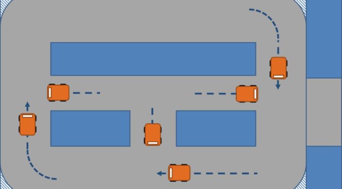
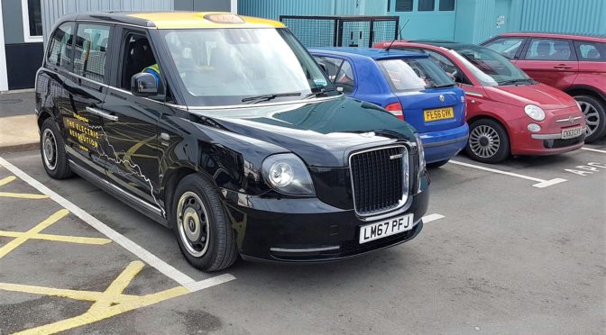
The driving style of automated vehicles is becoming an important factor for the automotive industry. It involves aspects such as the rate of acceleration and braking, the trajectory on bends, … Read more →
It was 2010, and I was just starting my PhD at Loughborough University in the UK. In the Design School, there was a small library – just two or three bookshelves – that held the titles relevant to the research groups sharing that area. We could always find something there to serve as a practical guide for conducting our studies. In my case, that meant researching user experience.
From time to time, the library was updated with new titles. These … Read more →
One of the oldest and most frequently used methods to understand users, their needs, attitudes and behaviours is the interview. After you developed a questionnaire, you can use it verbatim and you will get consistent and structured answers. You can also use a semi-structured questionnaire, where you have the basic questions, but have the freedom to explore each previous answer with new questions that you create at the spot. You may have some negative consequences such as more time to … Read more →
The WiCET project was featured on BBC News, when the researchers demonstrated the wireless charger to the TV crew. This technology was developed following the feasibility study that I contributed to. The video can be seen on LinkedIn here.… Read more →
I was trying to make Microsoft Excel display sharp times on graphs, but took me a while to figure out how to. I had this graph of time to complete the task, per group of participants. The X axis displayed the participant group, and the Y axis corresponded to time. But as you can see on the example, instead of showing rounded times like 2, 5 or 10 minutes, Excel was showing fractions like 01:26, 2:53 etc. I would prefer … Read more →
This website is the portfolio of Luis Carlos Rubino de Oliveira, contemplating User Experience Research and other works